Our main aim is the international market, so we need something that is definitively Greek, but steers clear of parochial “touristy” clichés.
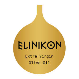
On behalf of Karoumpalis S.A., through in-depth market research, we were inspired and initially created the name of the product. We utilized the creative misspelling to take advantage of the “greek-est” possible brand name.
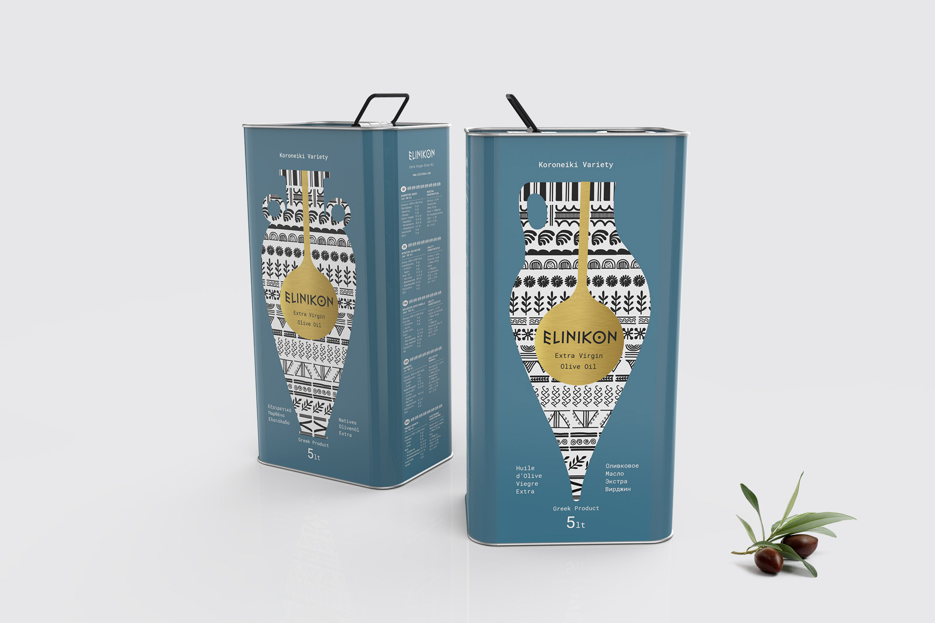
Subsequently, we created the design and overall aesthetics for the packaging of ELINIKON extra virgin olive oil. Our aim in creating this particular packaging was, upon placing it in a saturated market, to immediately and unambiguously underline its Greek character and the excellent quality of the product.
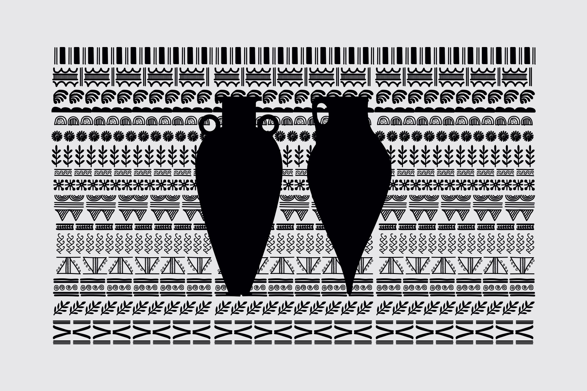
To achieve this, we created the logo font inspired by ancient Greek characters and used the silhouette of an ancient oil amphora with geometric decoration of frescoes and ancient vessels, clearly communicating the origin, the authenticity and, consequently, the quality of the product.