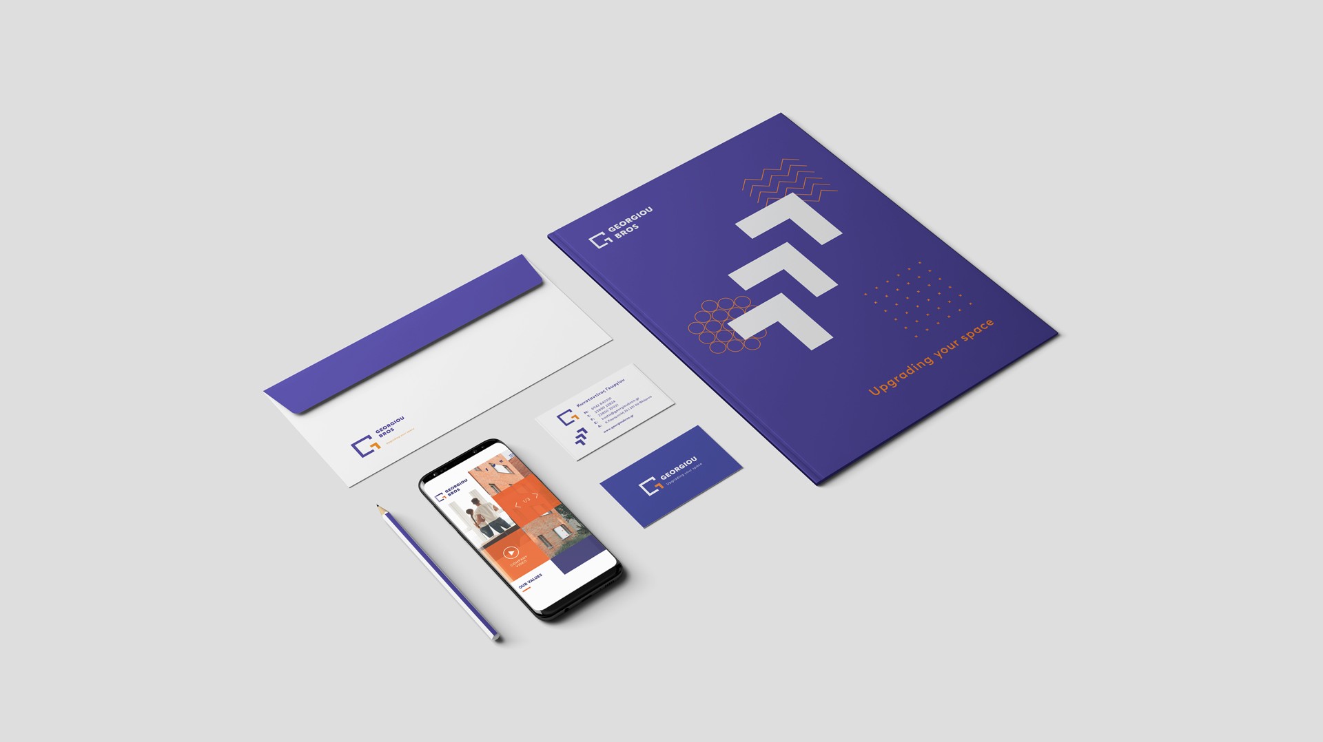
Our company is mainly active in the field of insulation frames. We want to build a new identity that will give us the opportunity to communicate the range of our services, in a contemporary and clean way.
We approached the logo based on the square, that simulates the frames of the applications that the company sets up. The letter Γ (from the owners’ surname) in the greek alphabet, was integrated inside of it, giving us the letter G macroscopically.
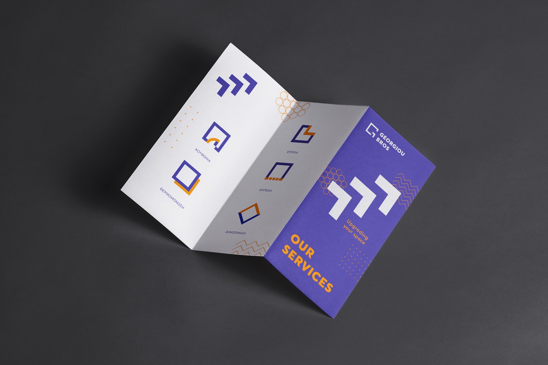
The sign that was created could develop in multiple ways, either as a base for designing the services, or as variable pictograms that could depict clearly every sector of the company’s activity.
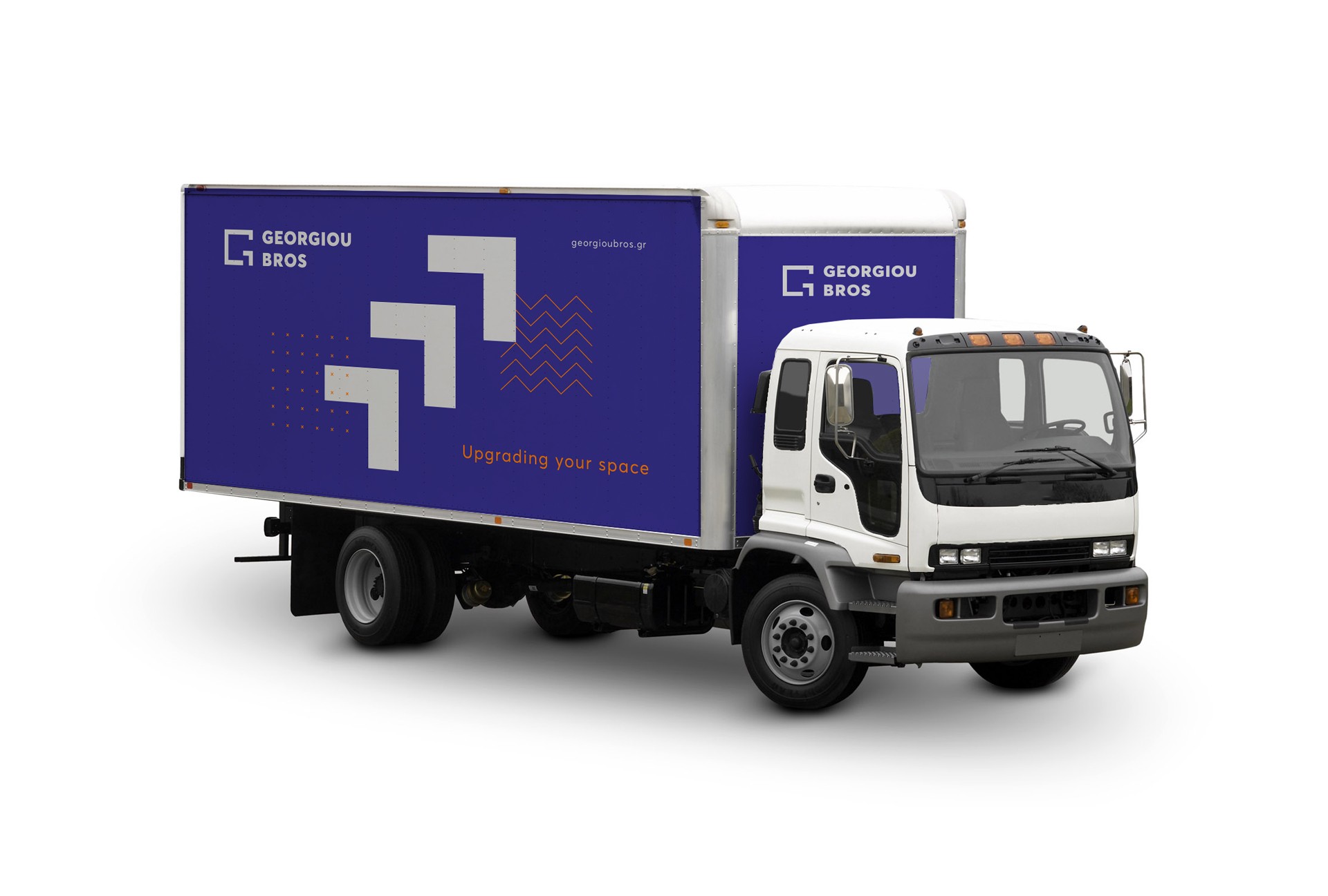
To complete the visual identity, three patterns were produced, inspired by materials used in building constructions, designed with thin and symmetrical lines in order to act as complement for further applications.
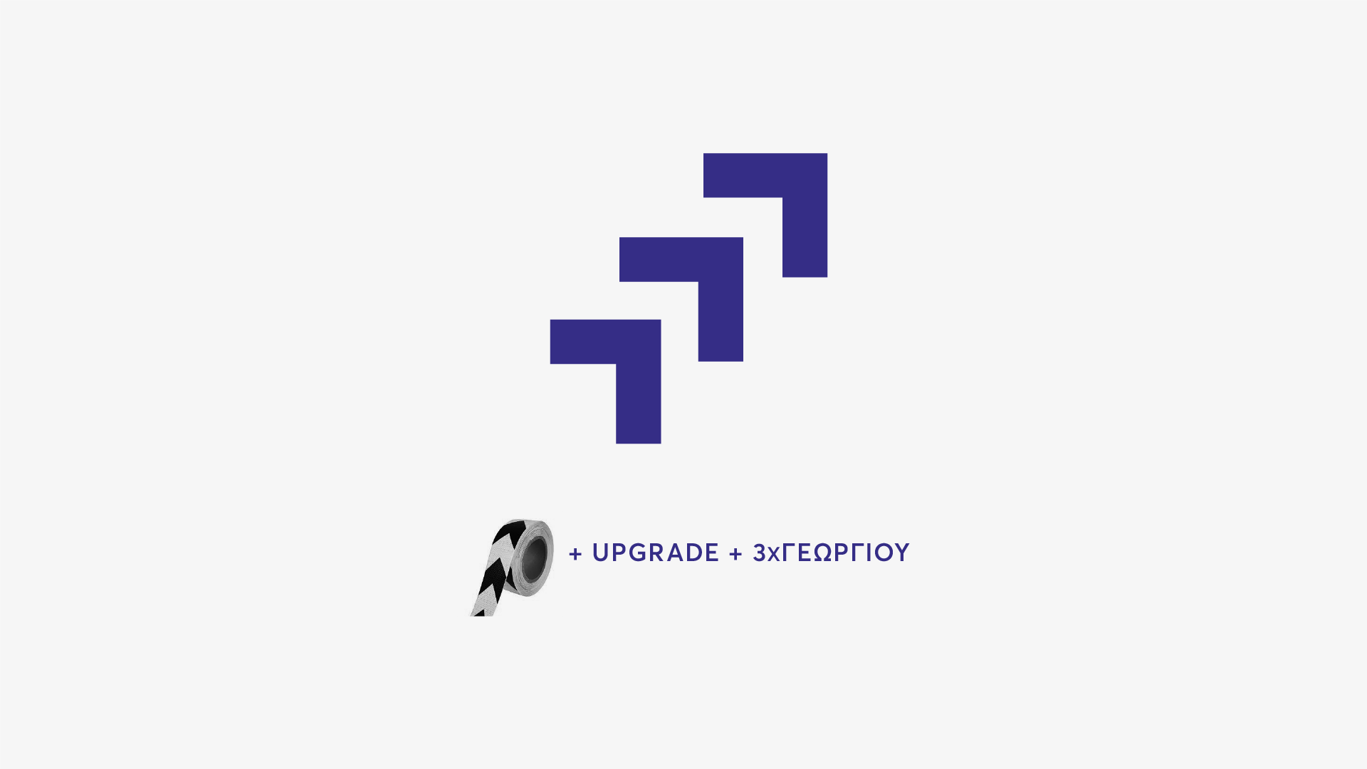
In combination with the tagline, another design element emerged. The three Γ letters, from the three brothers’ surname, would give us an upward arrow, that refers to construction sites and highlights the upgrade that the company provides.